HTML 1 — Teaser
Brasier Freeth & Hanover Green
Kings Langley
Brand Identity / Print / Digital
Art Direction, Designer
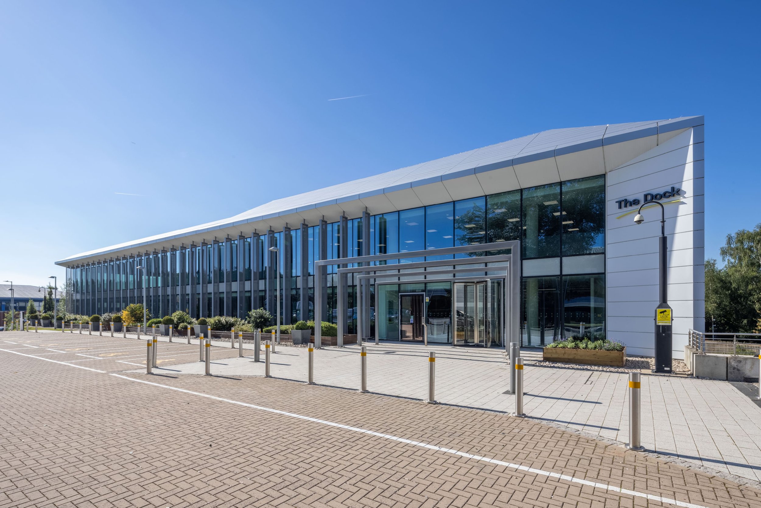
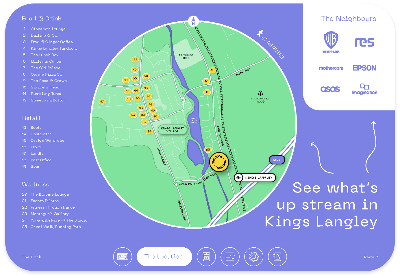
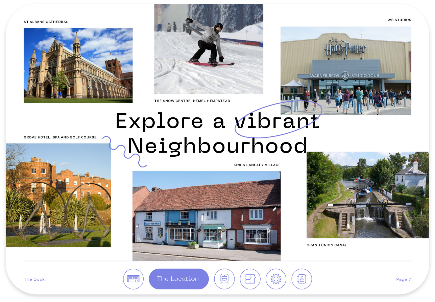
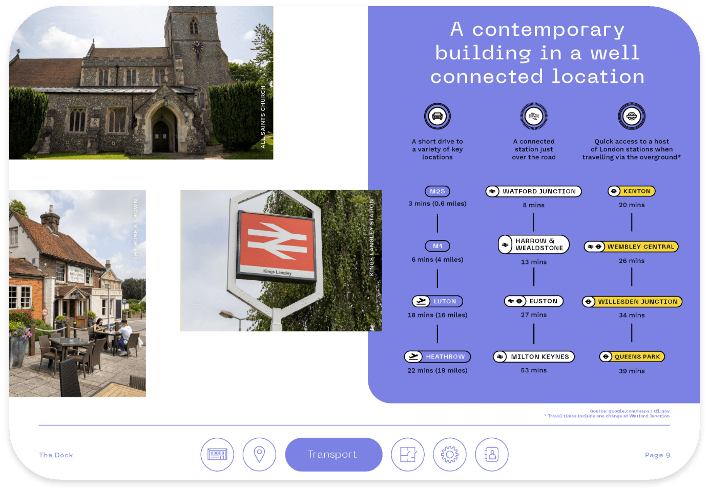
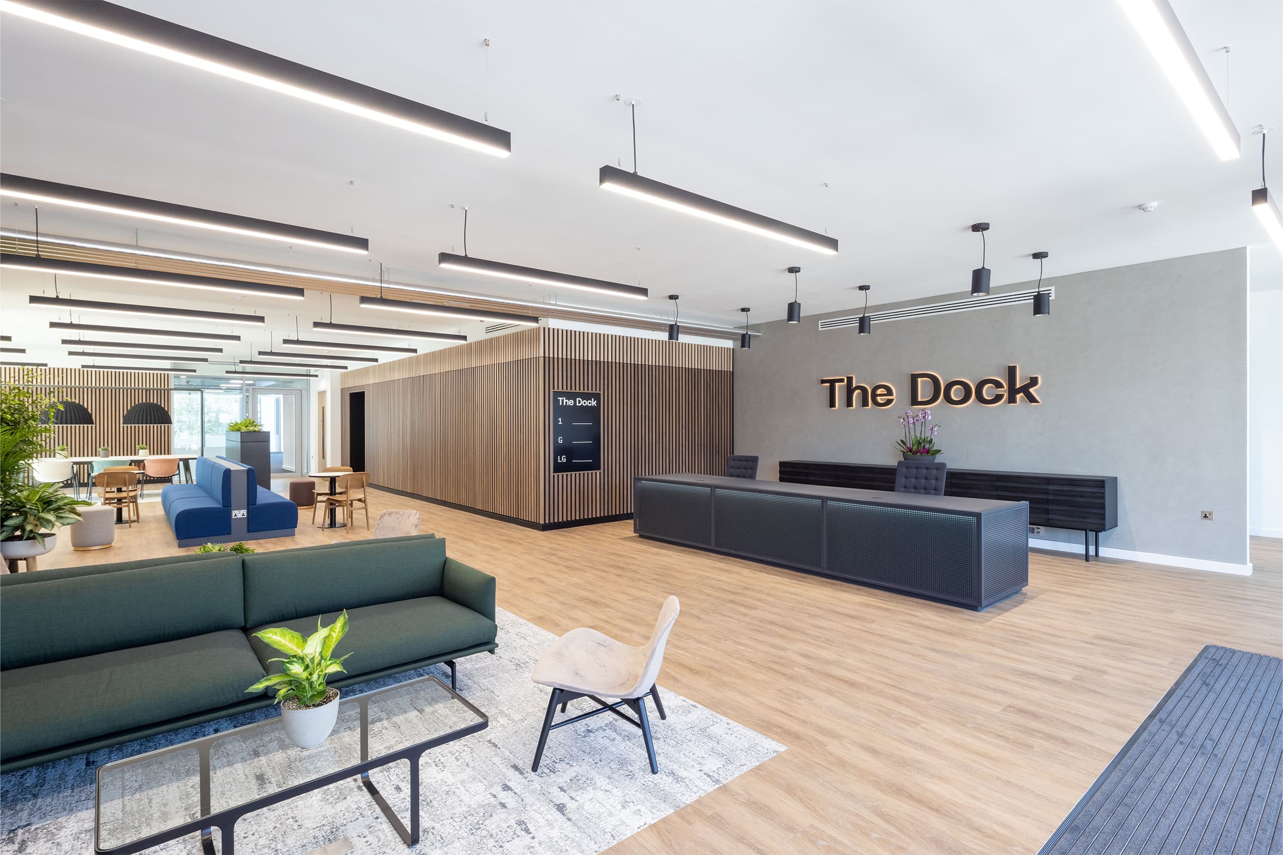
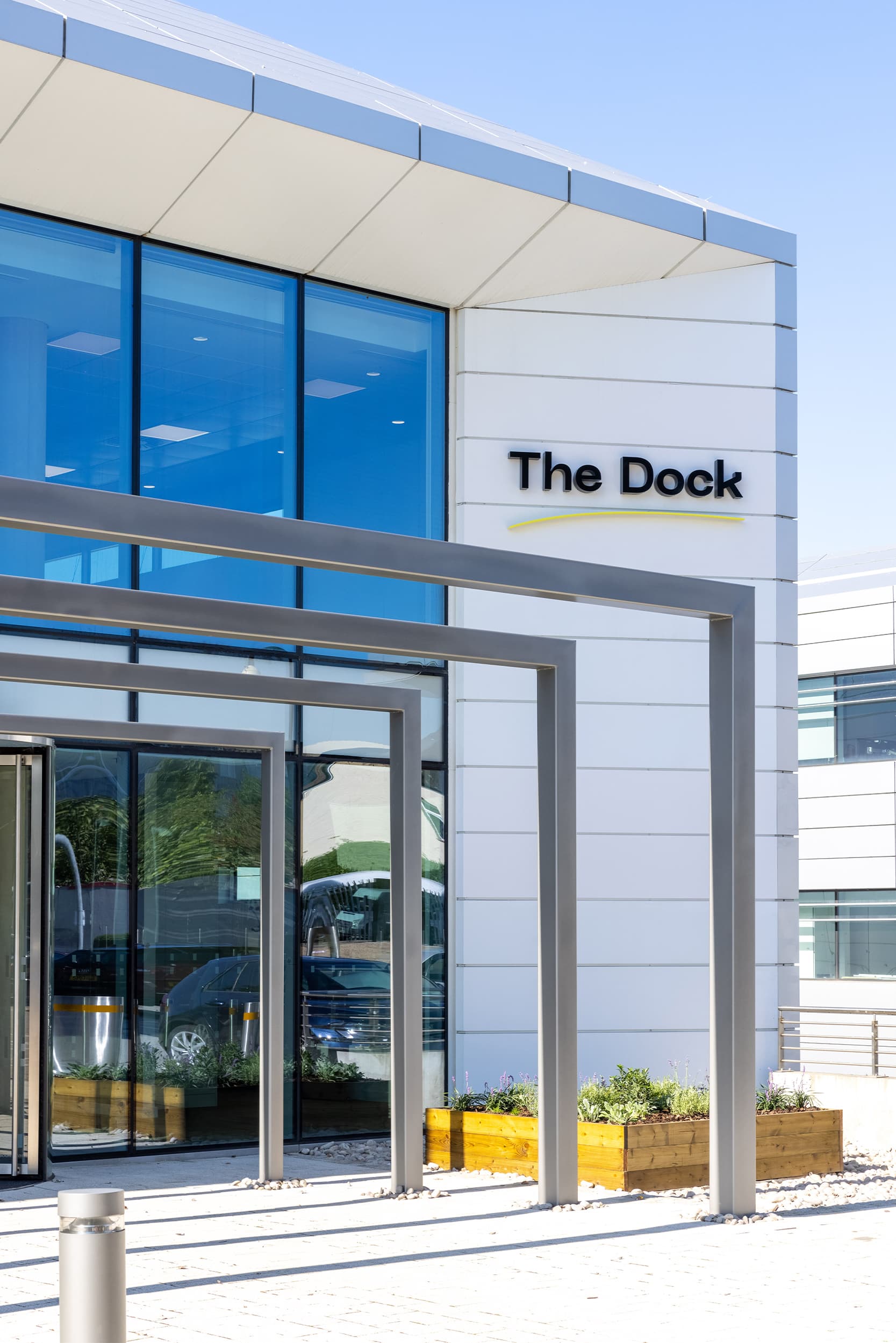
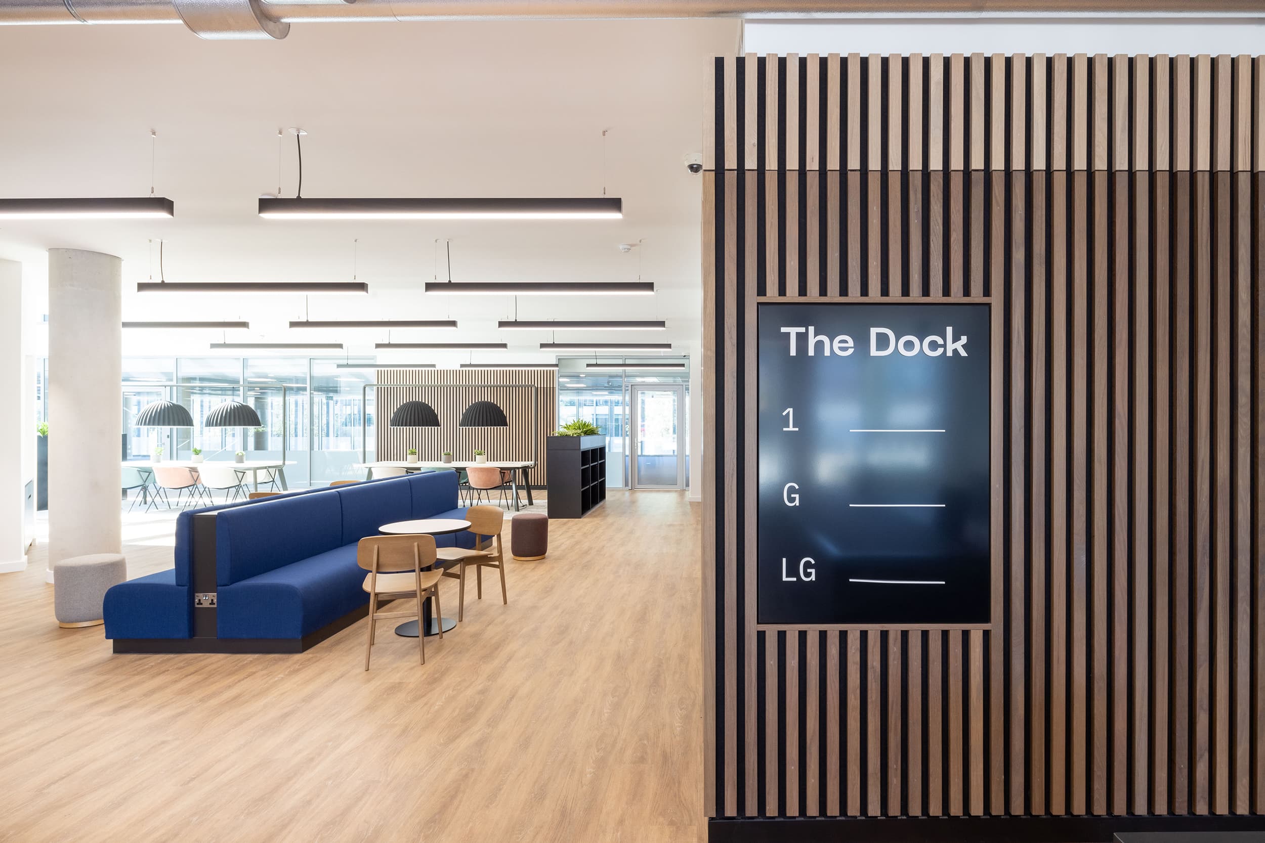
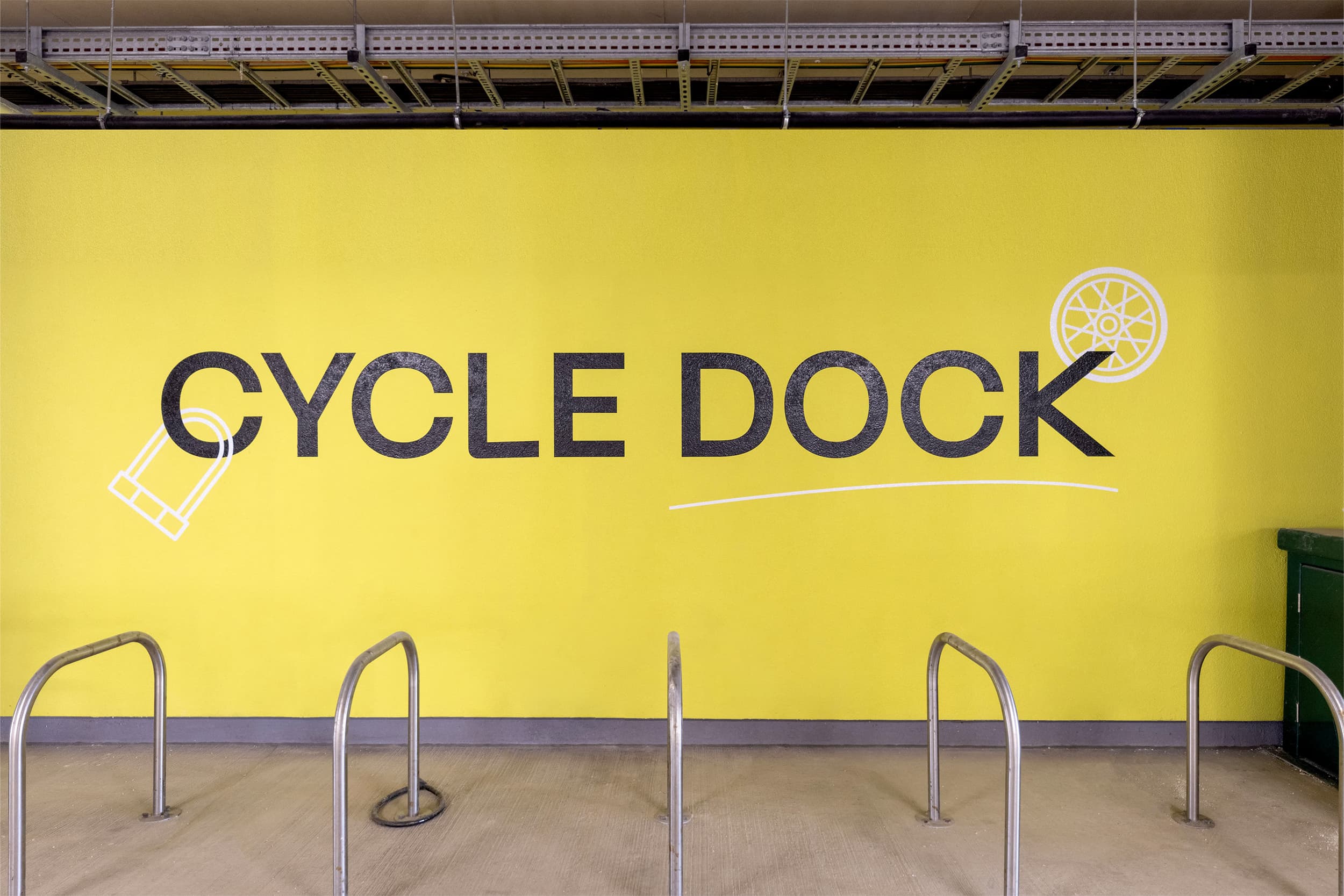
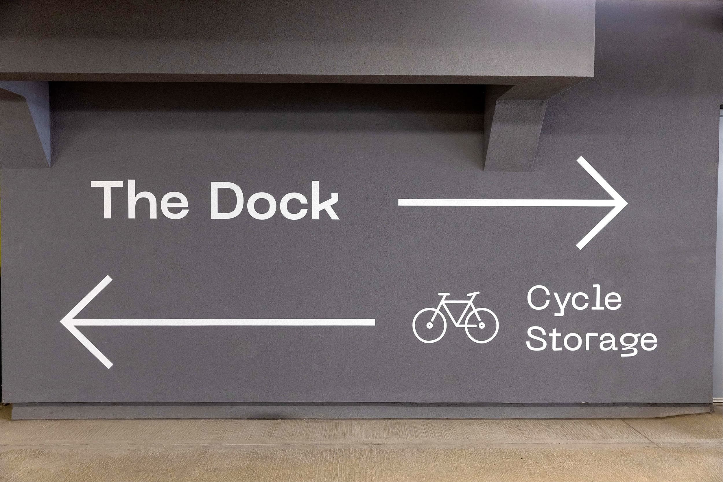
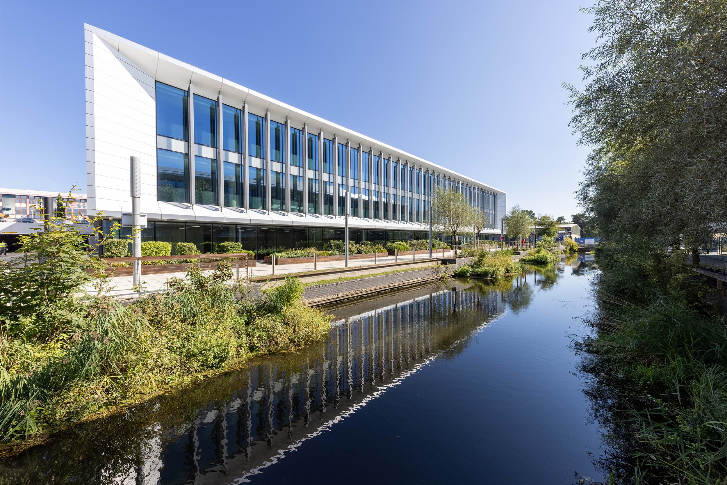
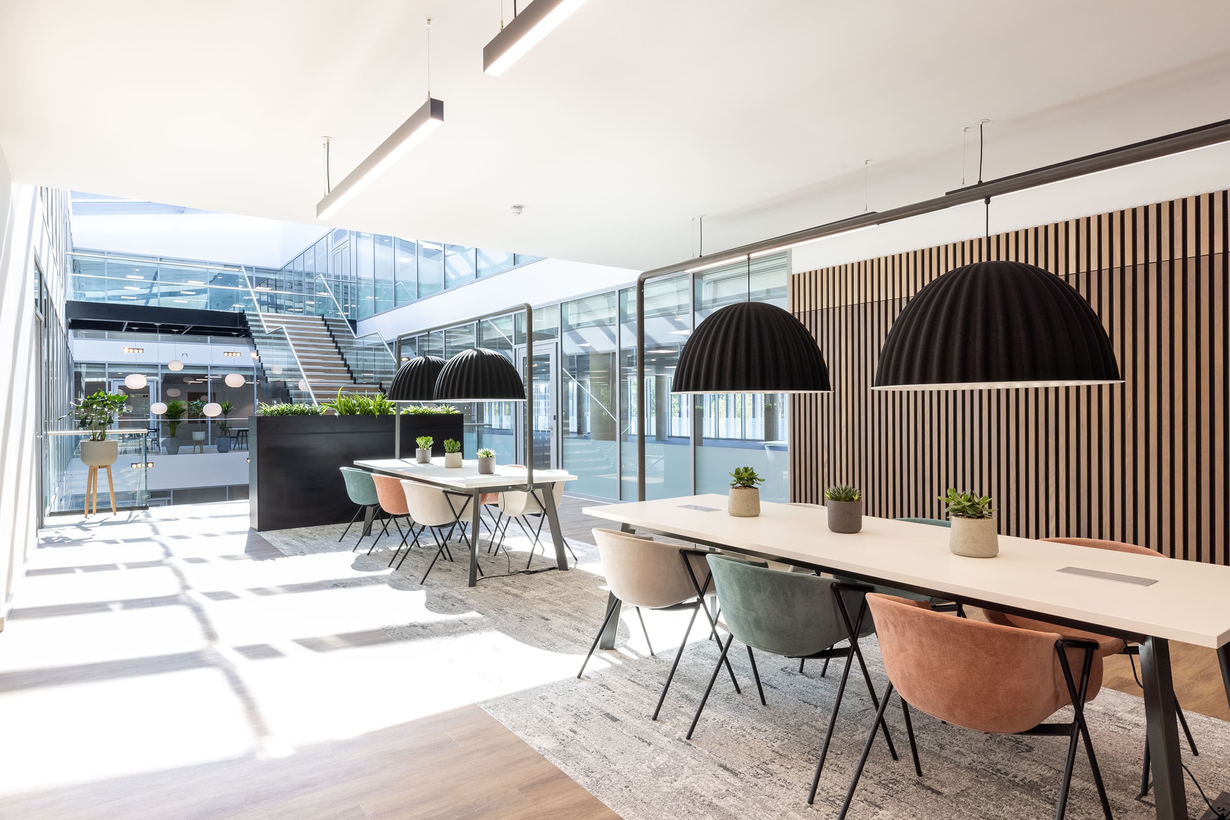
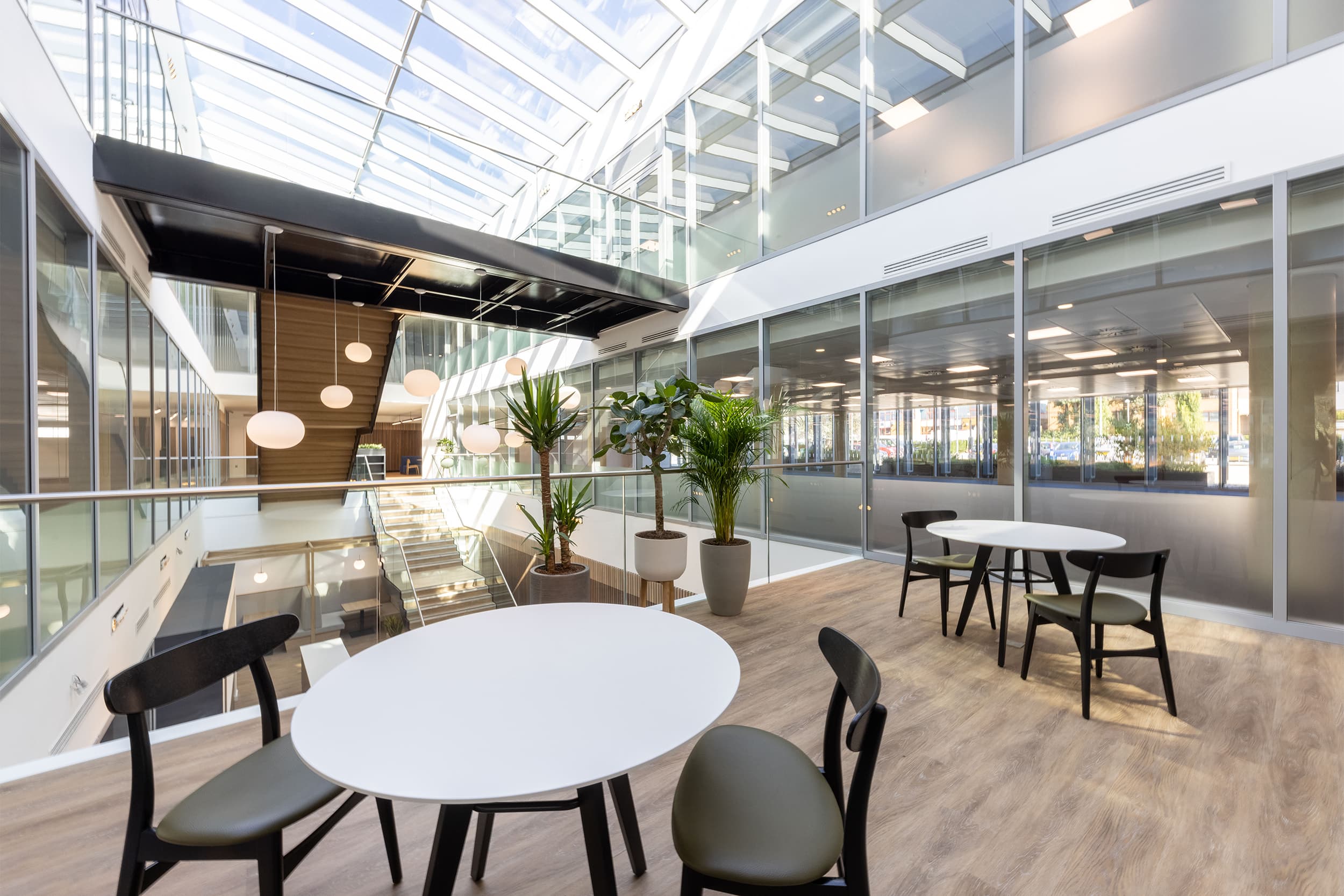
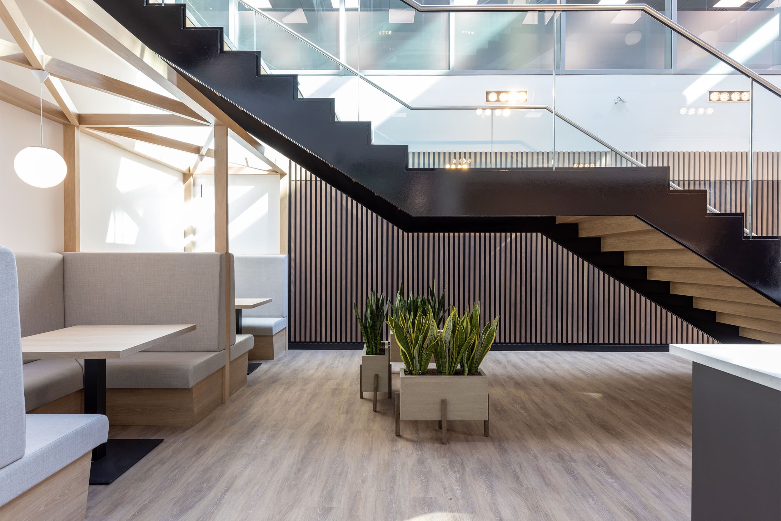
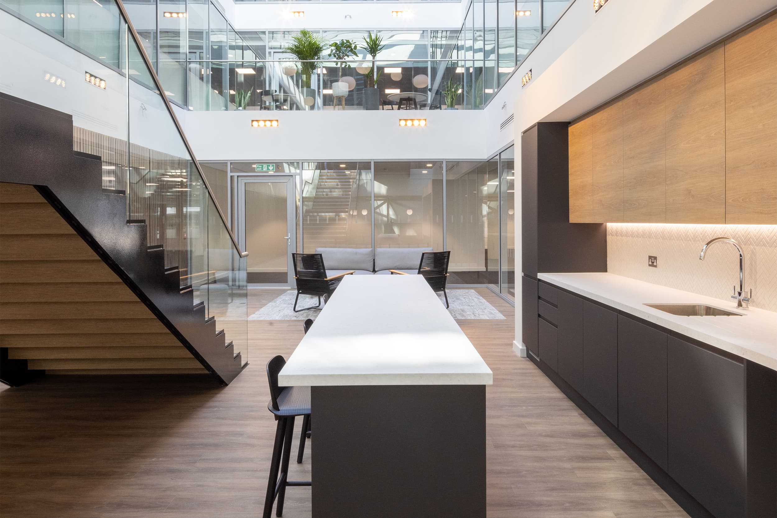
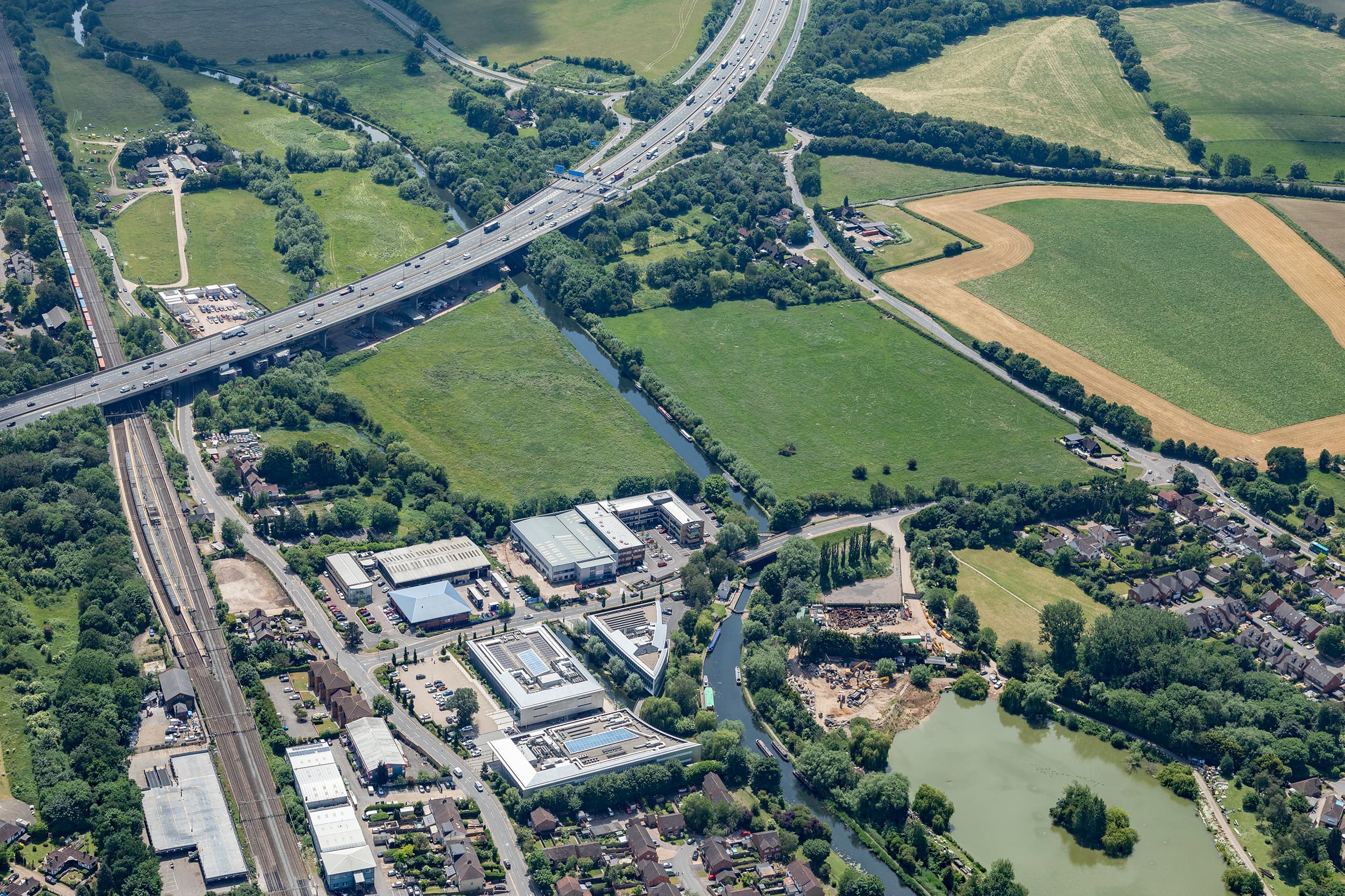
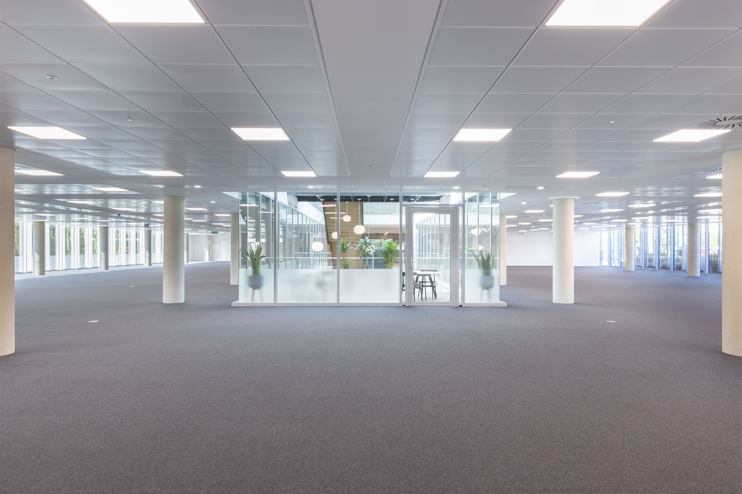
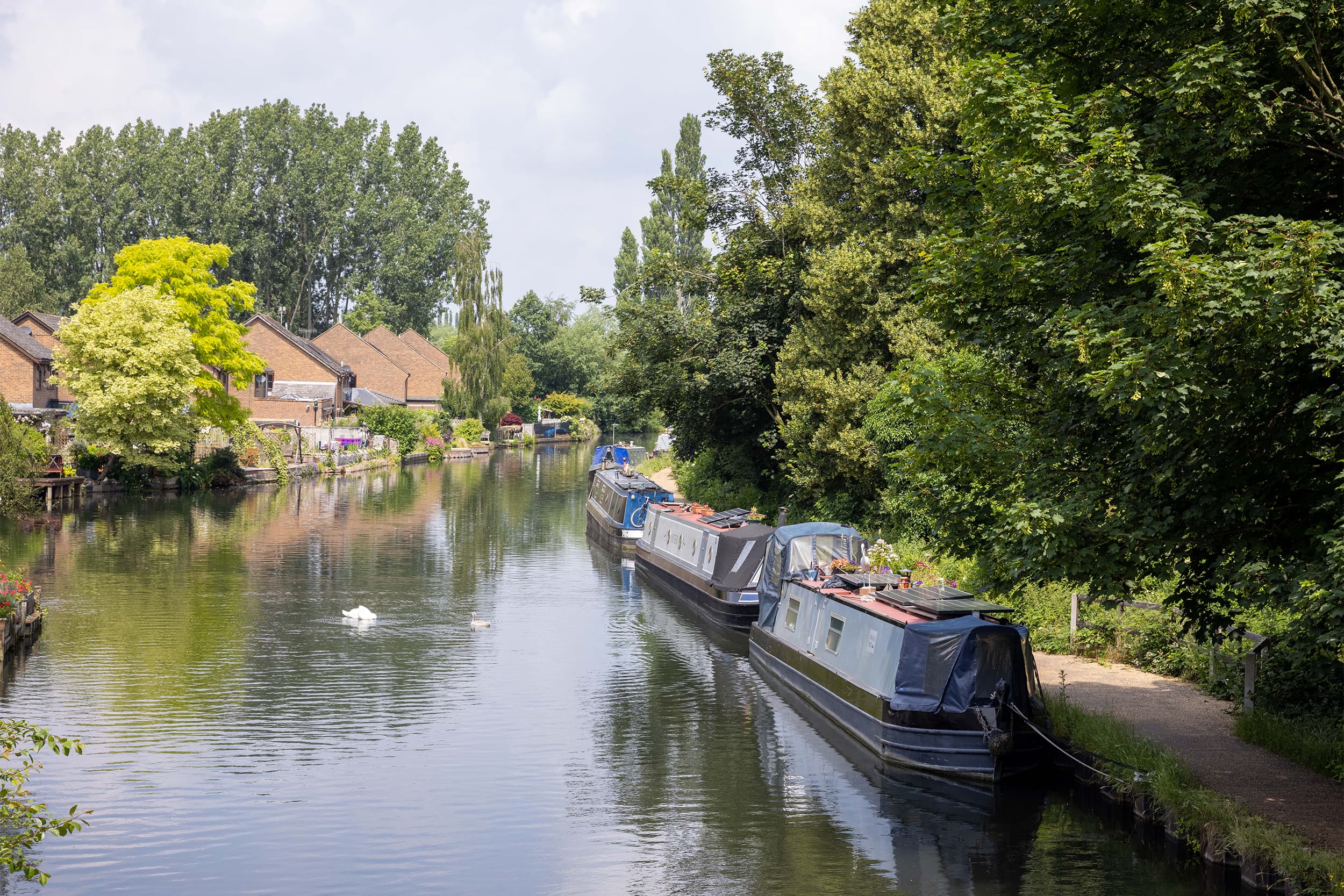
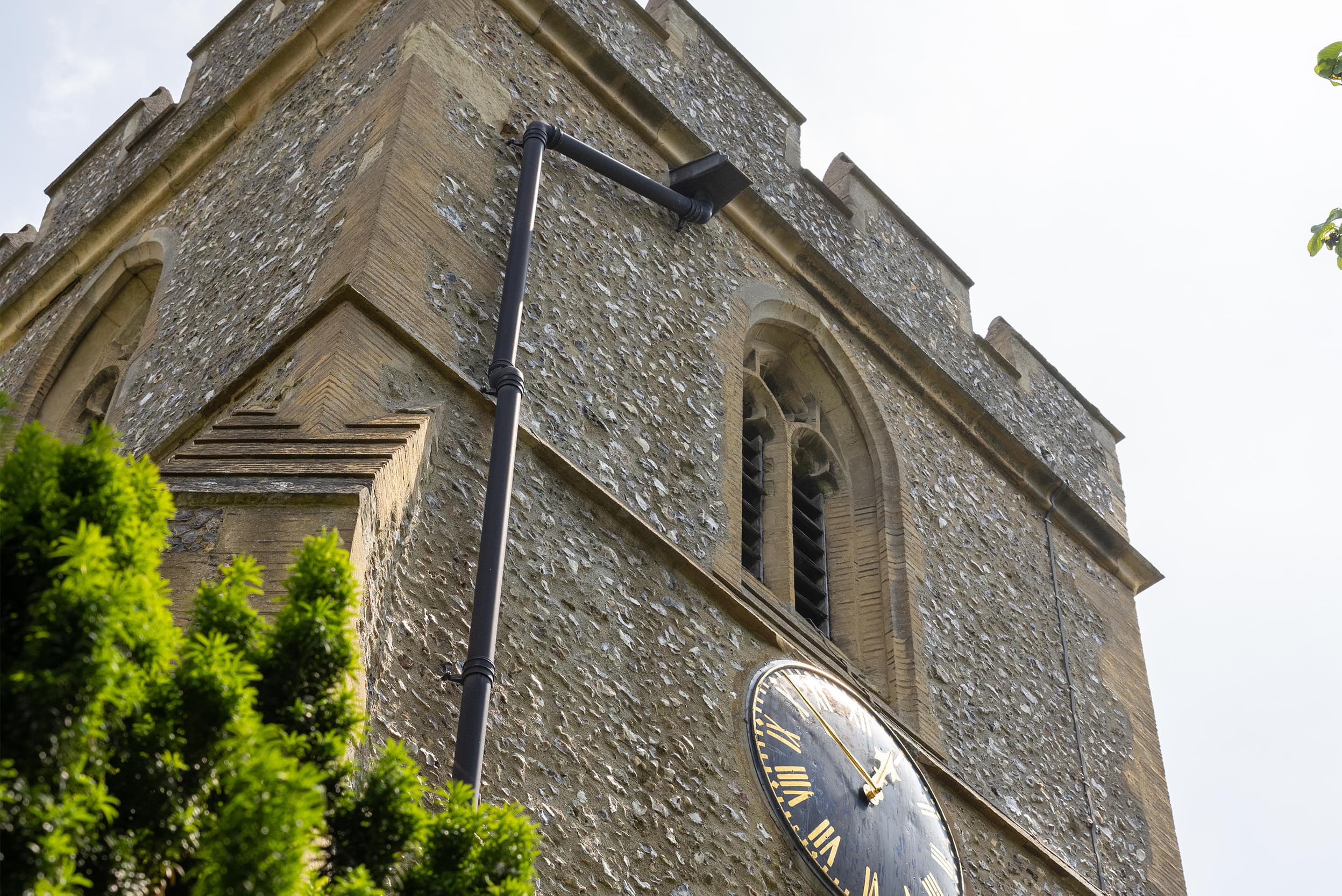
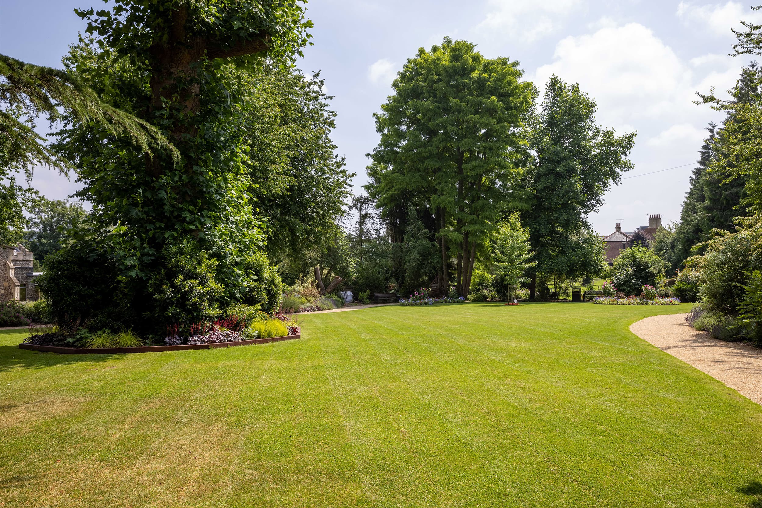
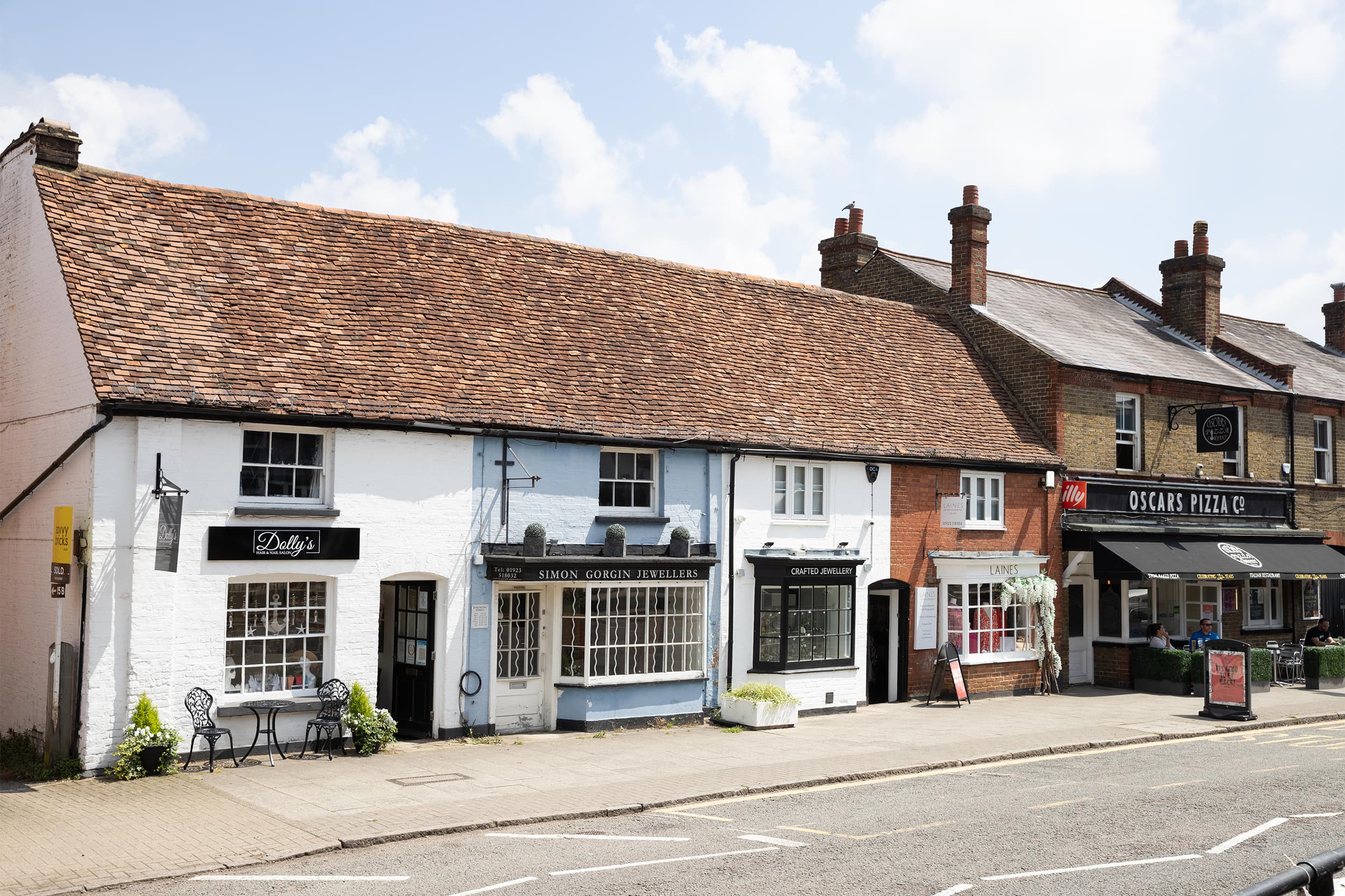
Positioned in the heart of Kings Langley, a vibrant neighbourhood with exceptional transport access, we elevated this striking and contemporary building with a fresh new brand. We settled on a new name, not only influenced by the building's locality to the Grand Union Canal, but also considering the nature of its forward-thinking tenants. Producing a multi-faceted campaign designed to encourage workforces to reassemble and ‘dock’ in for work, post Covid-19 lockdown.
To reimagine this newly renovated office building as a vibrant hub to encourage businesses and individuals to come back to the office following the Covid-19 pandemic.
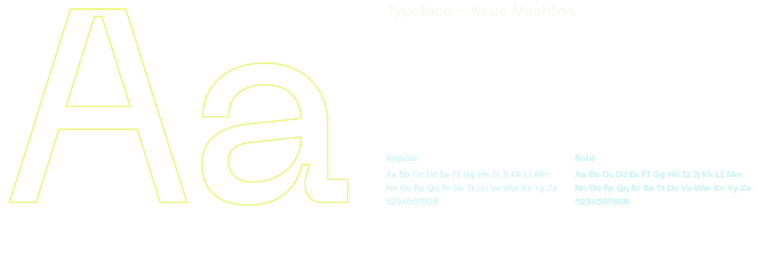
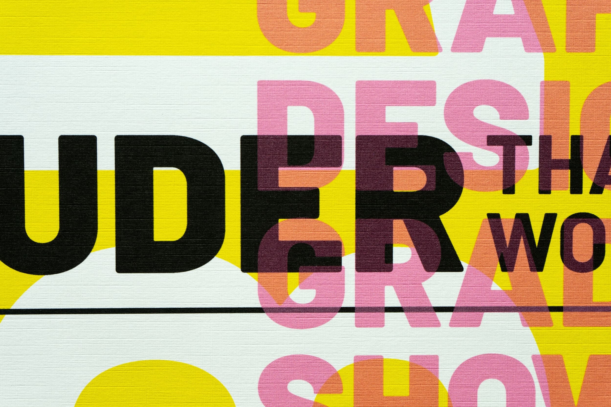
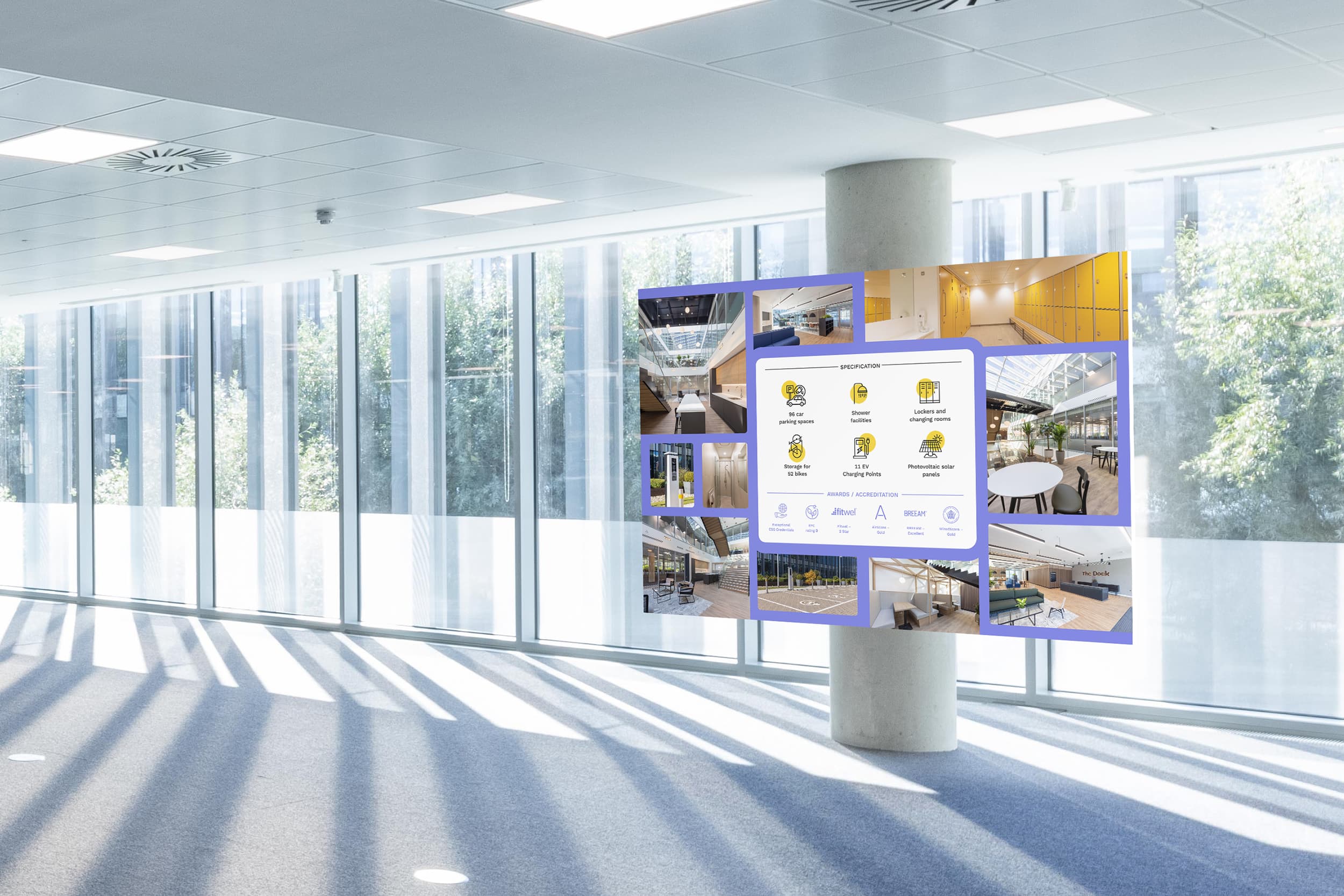
A bright, colourful and inviting brand that takes visual cues from the area and tone of voice from the idea of coming together.
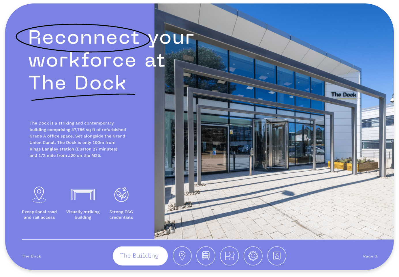
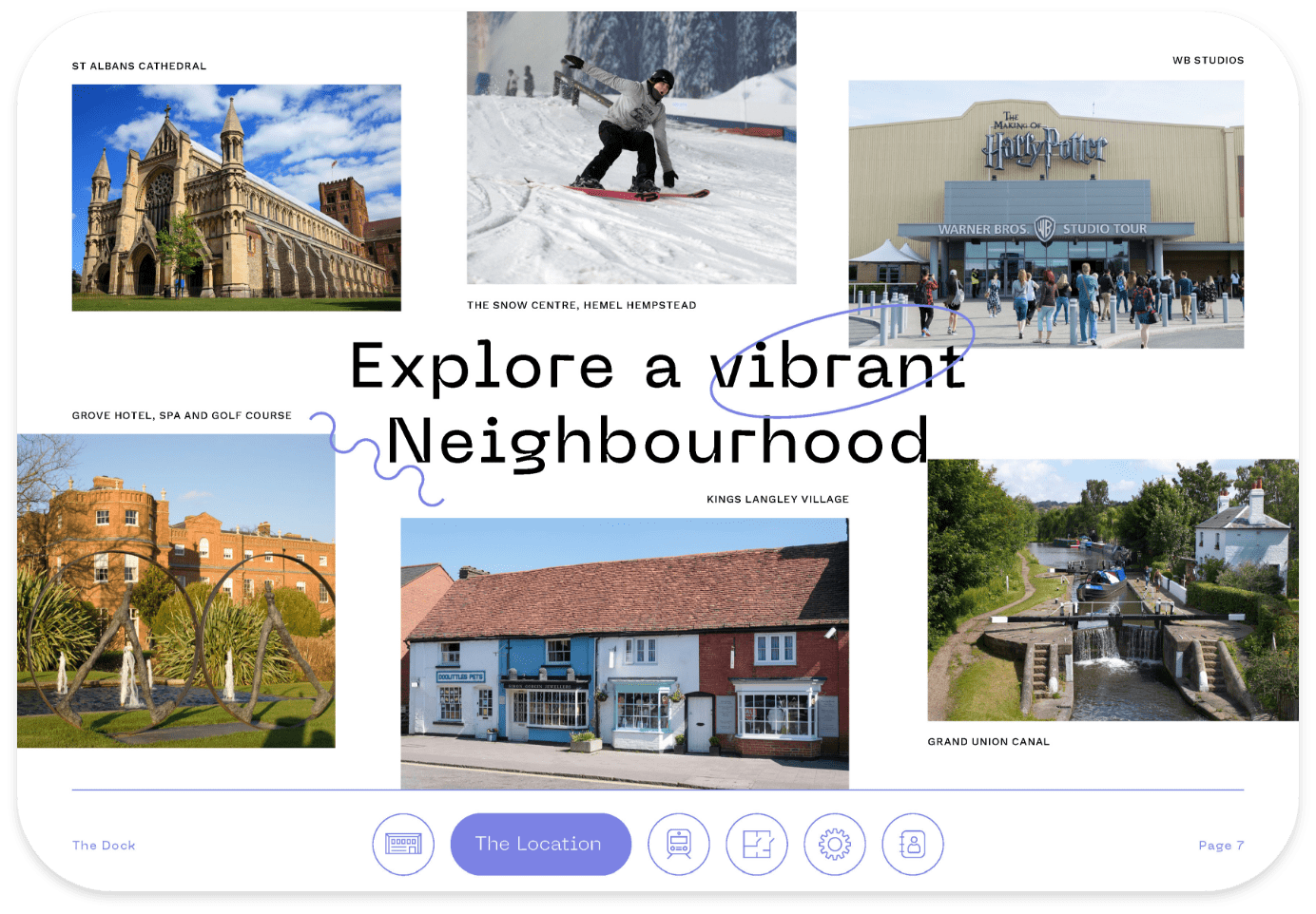
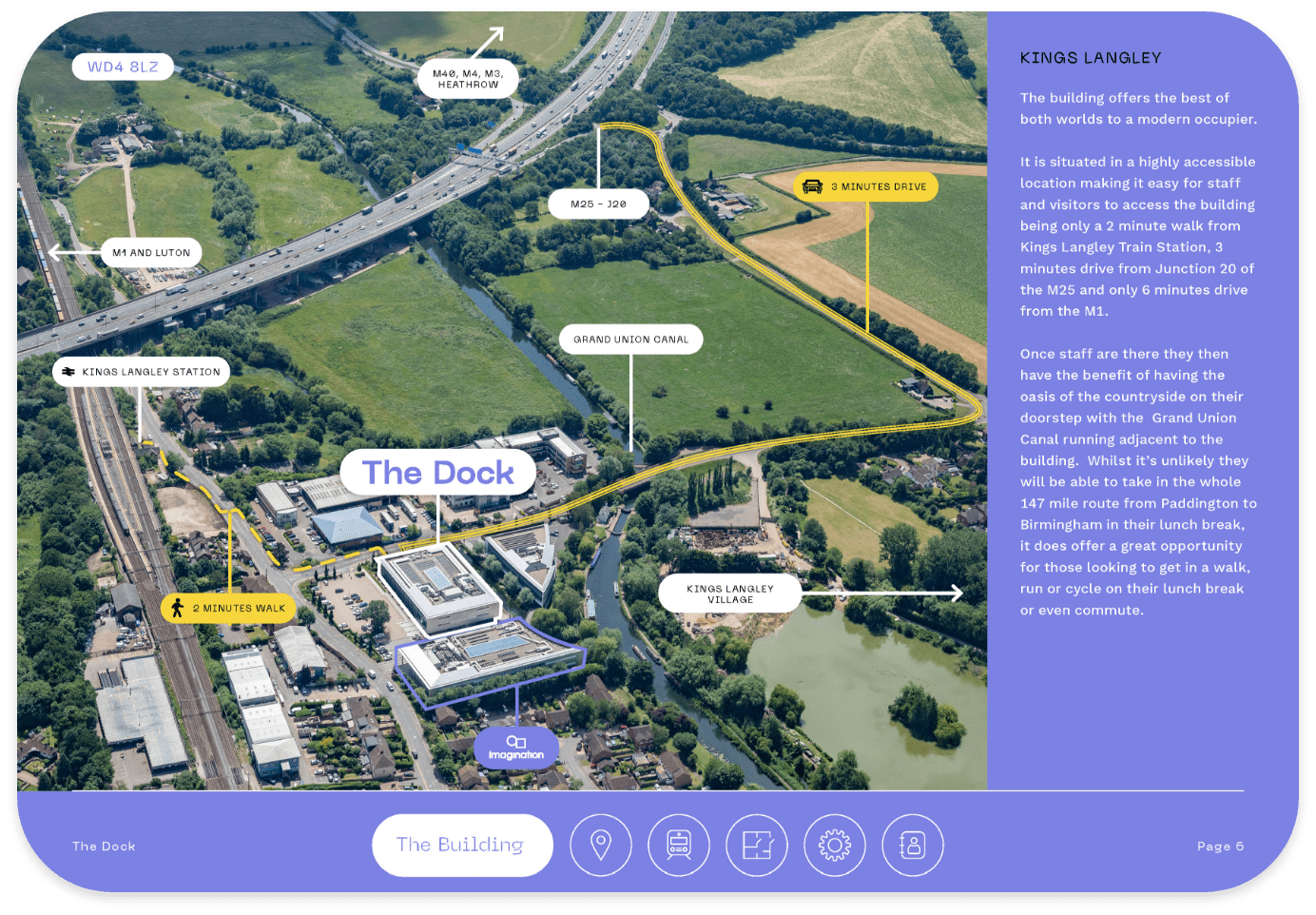
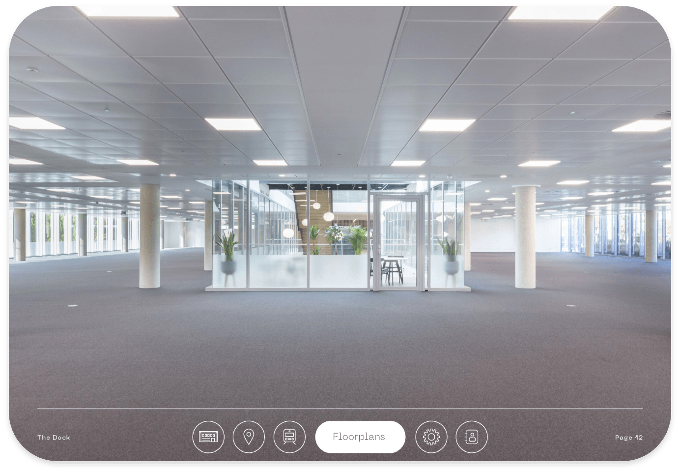
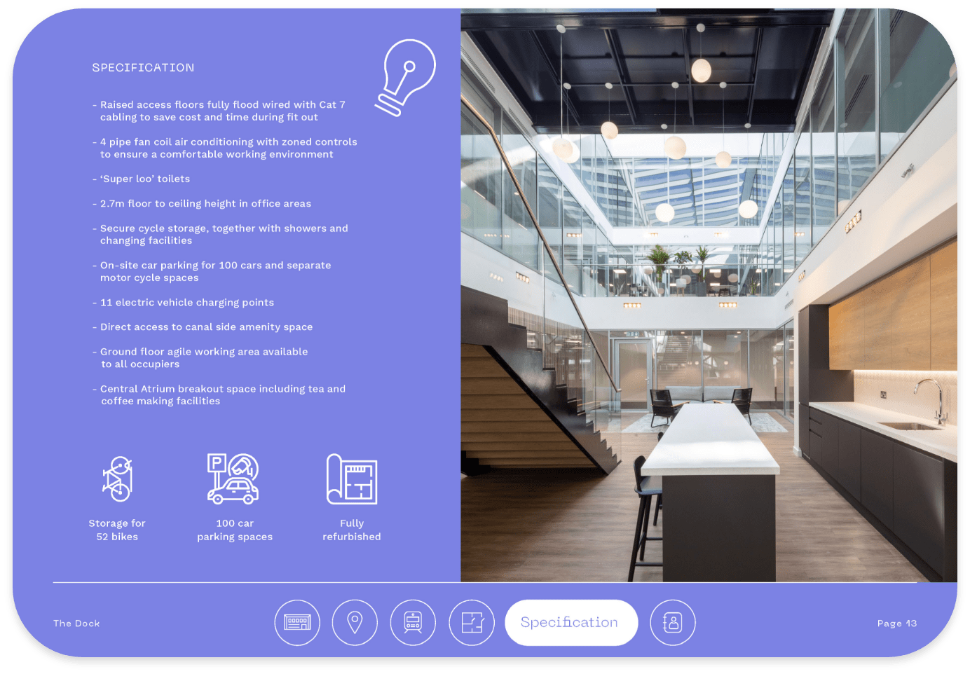
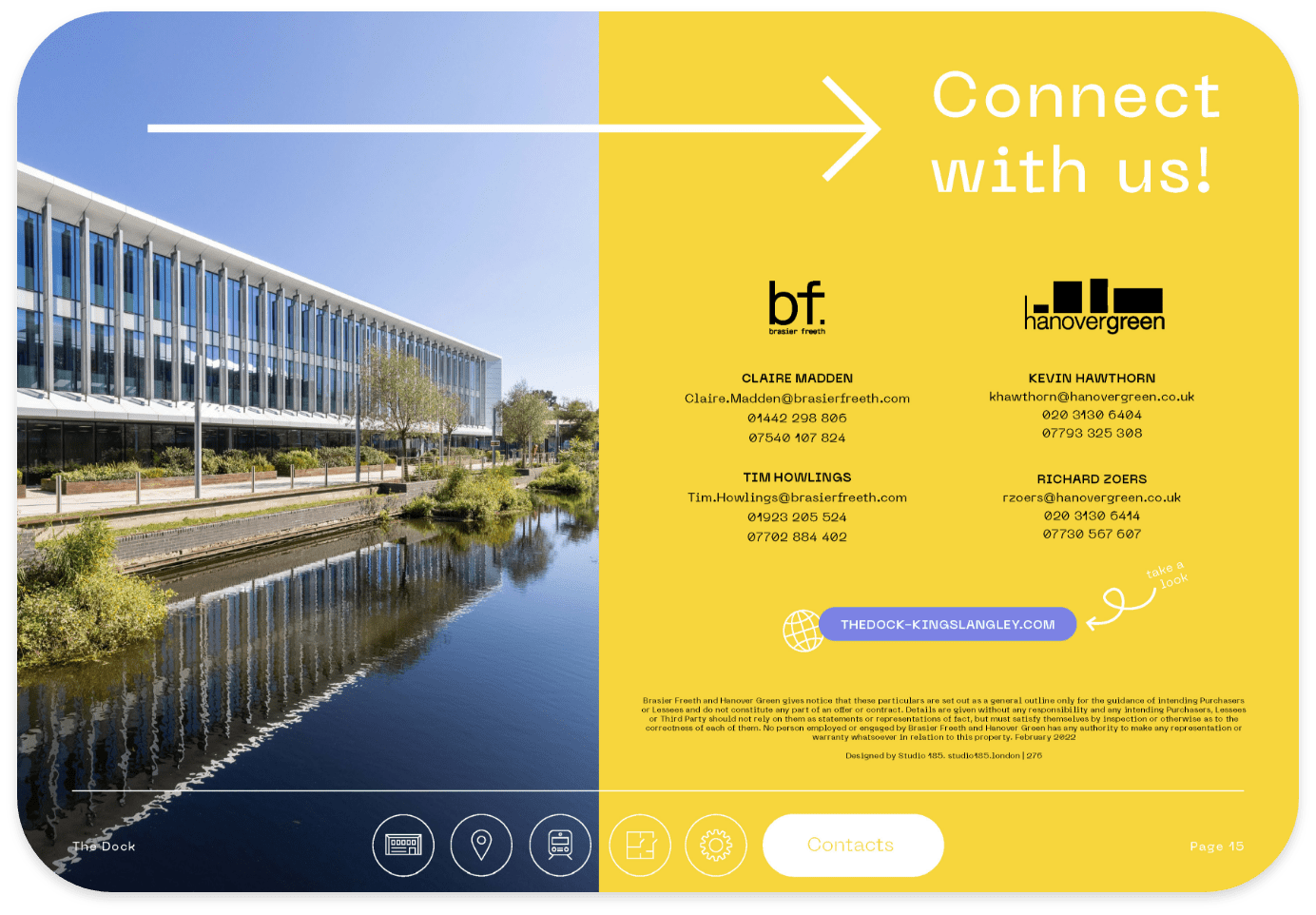
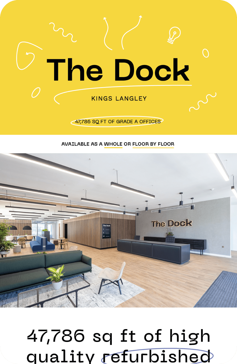
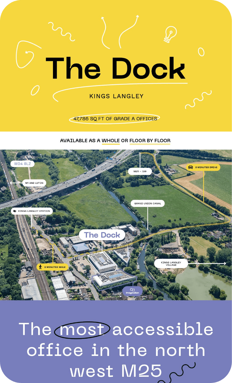
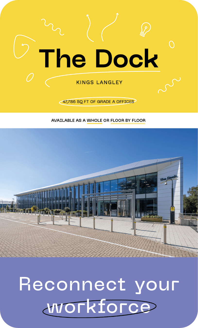
Utilised as a promotional piece included in emailers and social posts.

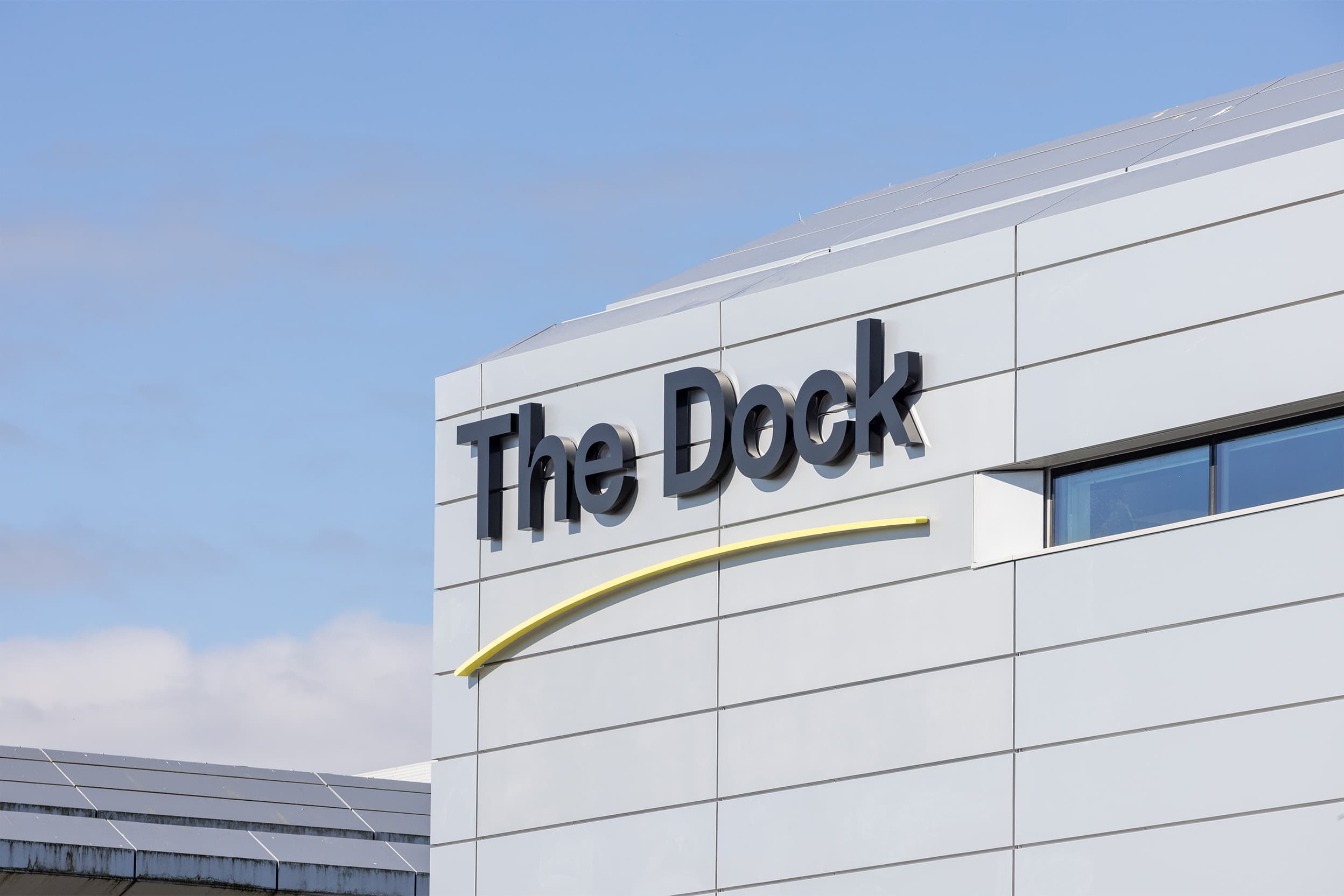
A bright, colourful and inviting brand that takes visual cues from the area and tone of voice from the essence of coming together.